Client
American Fork
Project Overview
The City of American Fork is considered by many to be the hub of Utah County. Situated between two of Utah’s largest metropolitan areas, the city offers convenient access to almost everything. The city’s sense of equilibrium goes beyond geography—it’s not overly urban or overly rural; it’s not too big or too small. While other cities advance rapidly toward unencumbered modernization, American Fork balances its progress with a healthy respect for its roots and a strong connection to its past.
Services
- Branding
Problem
As Utah County has experienced immense growth, American Fork wanted to protect its own unique identity and to distinguish itself from other cities that were losing their traditional sense of home. To succeed, the city needed a well-defined brand foundation, promise, and personality that could translate into a stylish visual identity.
Solution
Through research, exploration, and invaluable input from residents, we developed a clear vision for the city’s identity: a classic American town with classic American values: patriotism, family, hard work, and hospitality.
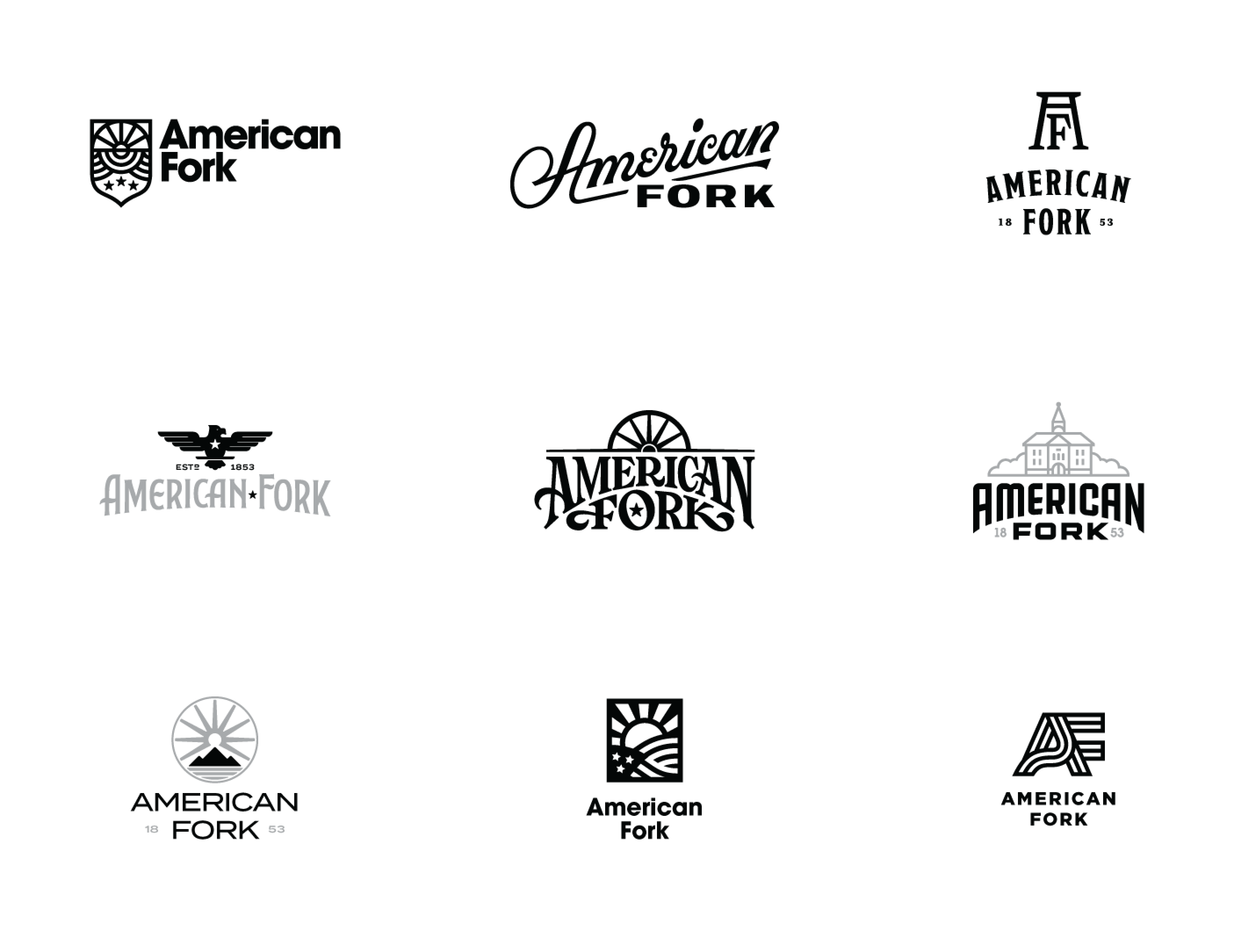
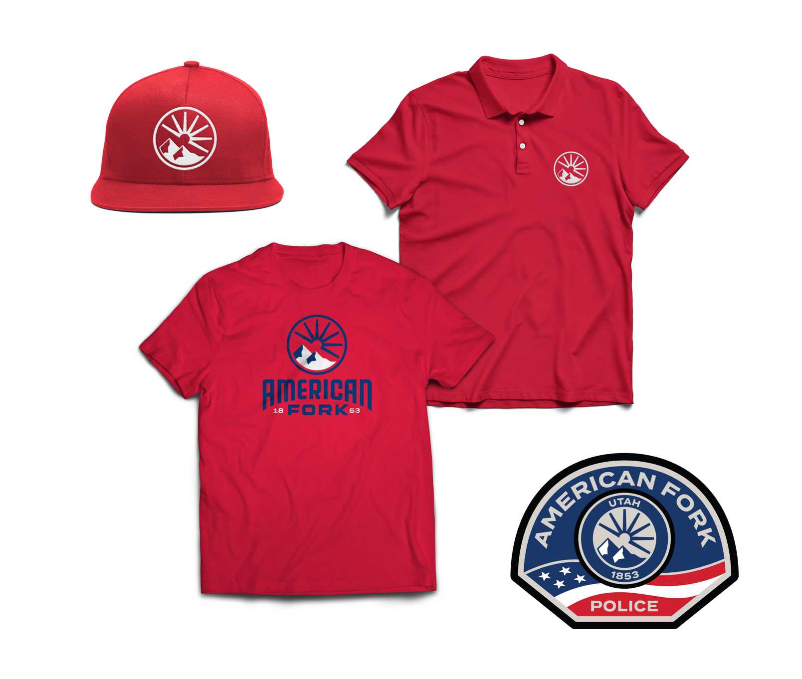
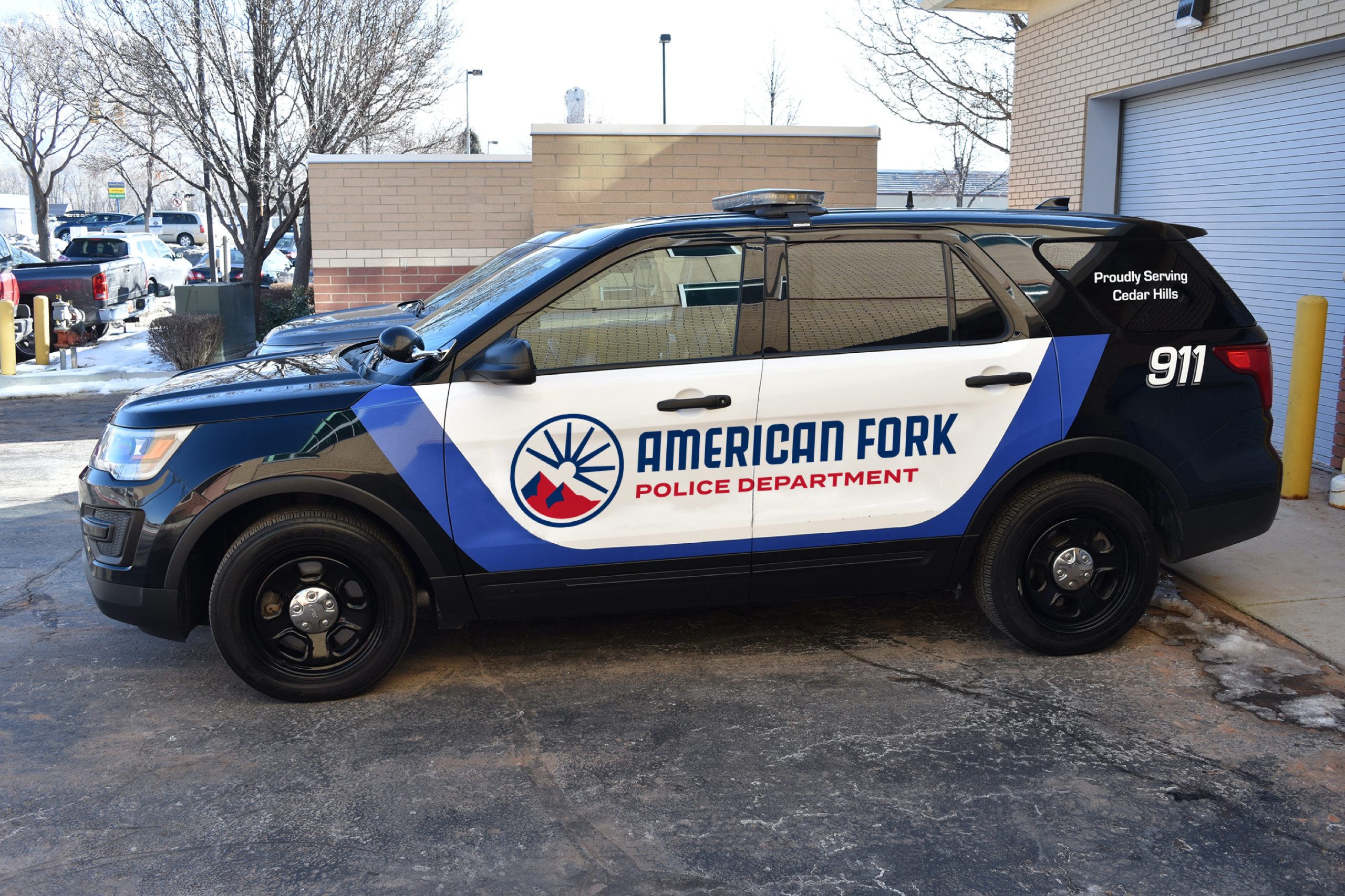
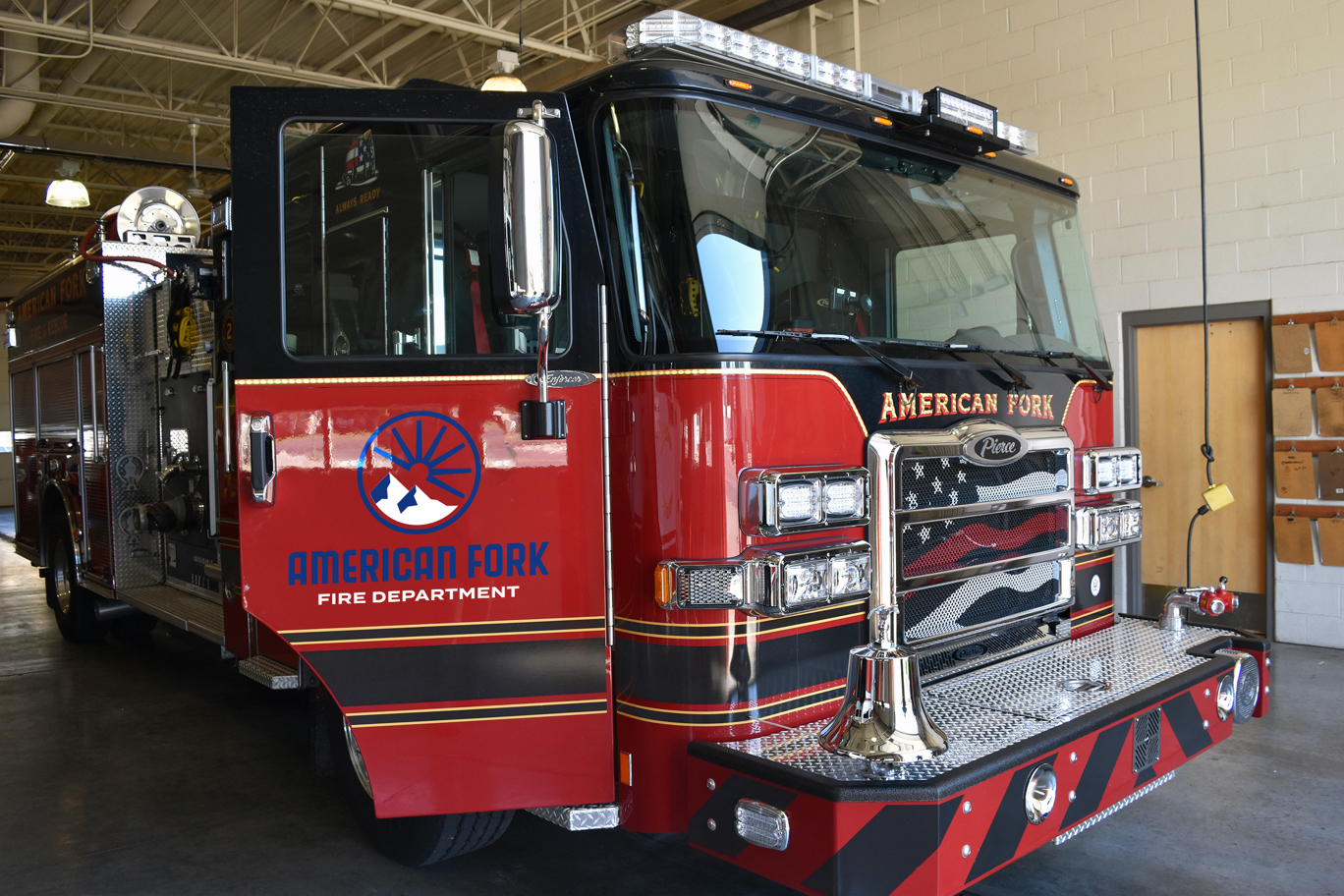
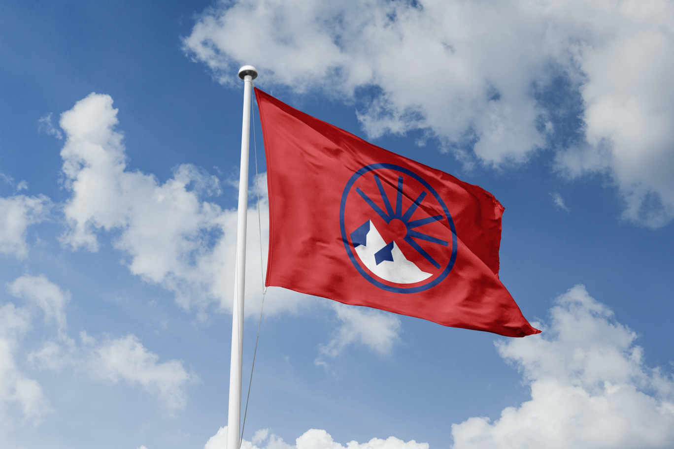
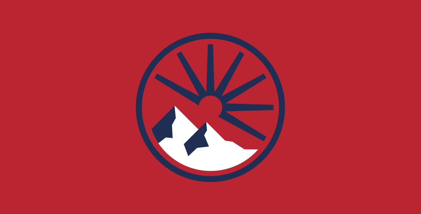
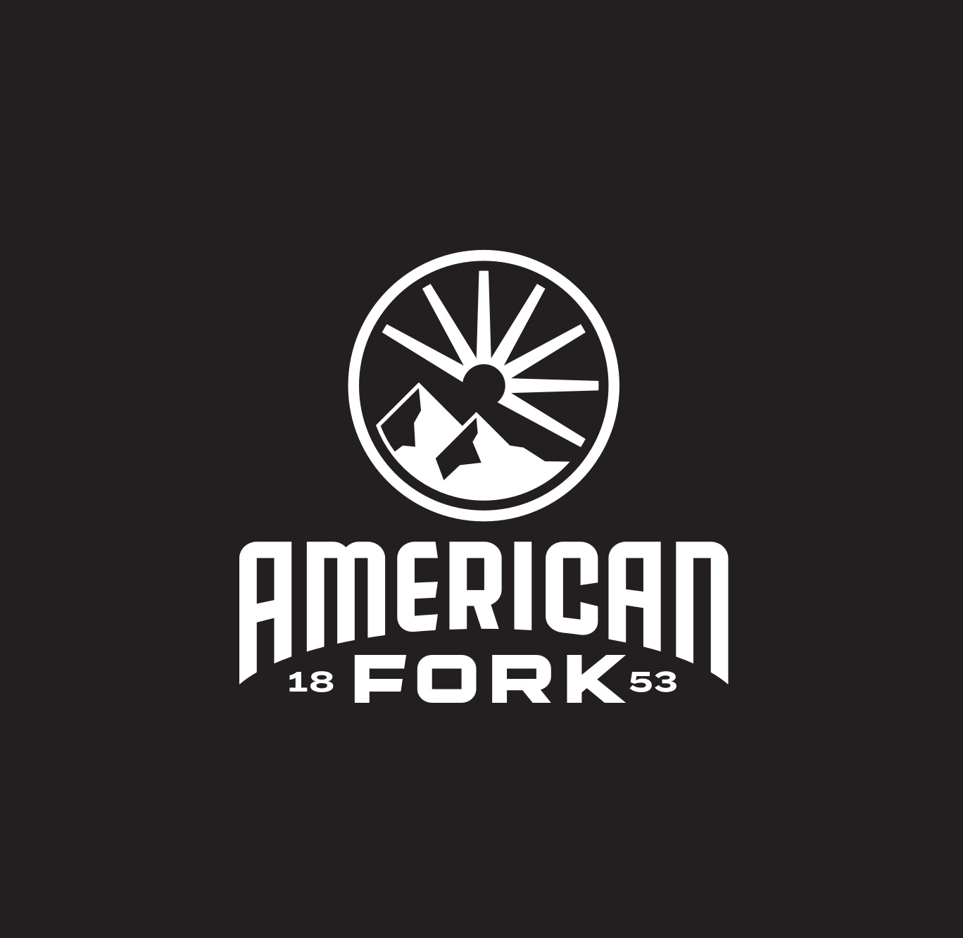
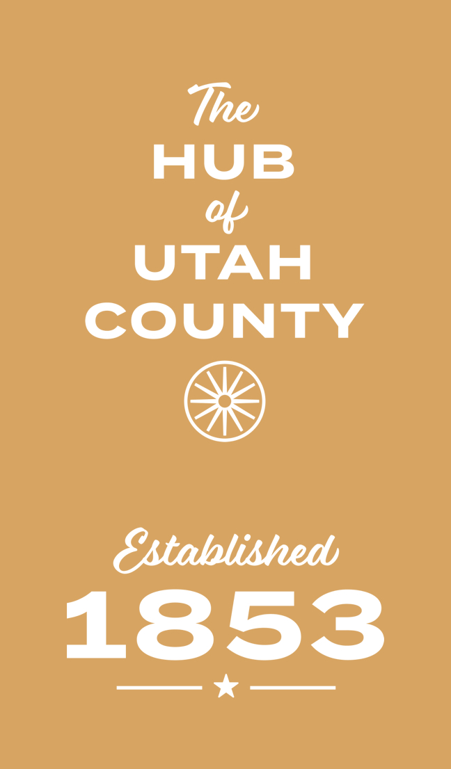
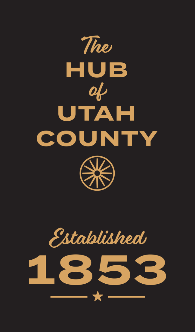
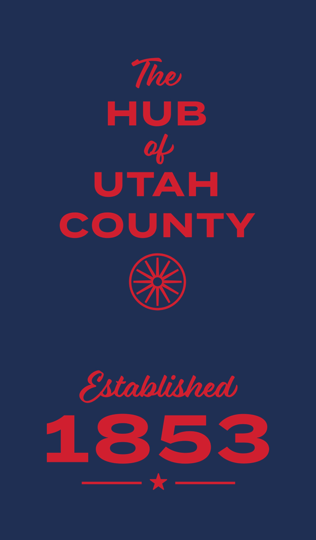
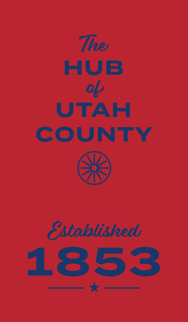
During an in-depth logo exploration phase, we developed a variety of ways to capture the brand and to represent the city’s personality. The final solution is comprised of key visuals that celebrate the unique features of the city, its history, and its location. The lines radiating from the center of the logo represent wagon wheel spokes. This feature pays tribute to American Fork's pioneer legacy, while also emphasizing the city’s central location as a hub of Utah County. The lines also double as light rays emanating from a central sun. The mountains rising from the base of the circle represent the peaks of the Wasatch Mountain Range, as well as American Fork Canyon and other natural features of the surrounding environment.
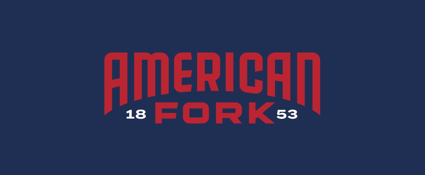
American Fork is one of only a few cities in the United States to carry the name of the nation. The brand’s primary colors were inspired by the American flag and were carefully selected to reflect the city’s deep-rooted sense of patriotism and pride. Several accent colors were added to the brand palette to allow for visual differentiation and interest. Other elements, including official fonts and additional graphic elements, help round out the brand while giving the city everything it needs to communicate in a more effective, professional, and memorable manner.
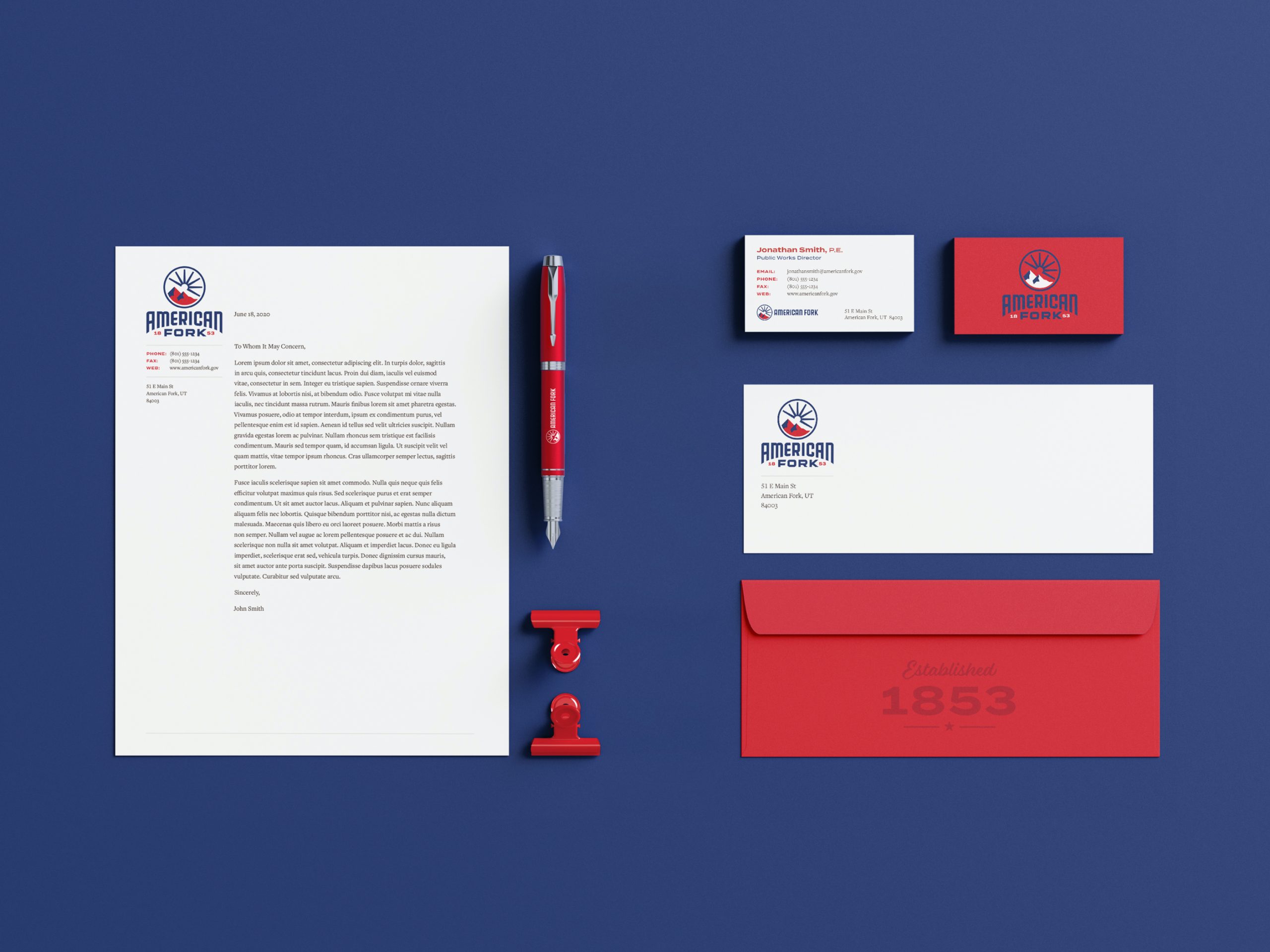
As a capstone to the branding process, we developed an in-depth brand standards guide to ensure consistent brand application and to serve as a foundation for application across the city’s many assets and materials. While that process of brand application is still underway, we have already had the opportunity to develop business cards, letterhead, envelopes, police patches, and other materials.