As our buying options evolve, so do our marketing efforts. Marketing highlights have changed from “what it has” to “what it does” to “how it makes us feel” and today, to “how it identifies with us.”
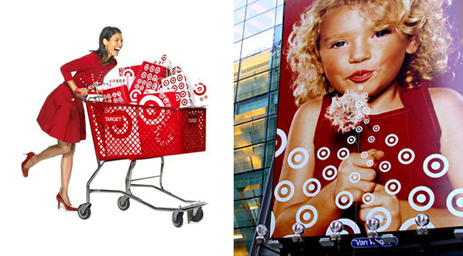
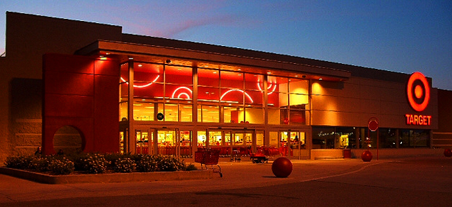
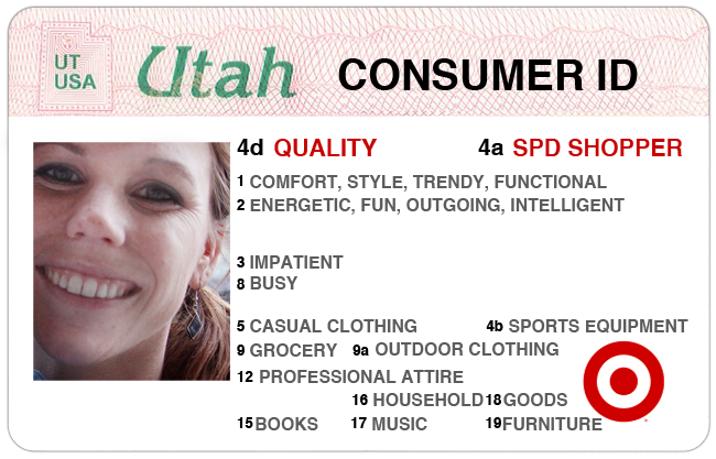
For me, “Target” does this extremely well. From their marketing to store appearance to what they actually stock in store. Target has positioned itself to stand for what people want: Happiness, comfort, style, intelligence, fun, and so on.
Target’s branding successfully identifies, informs, entertains and persuades me. Above all, they make me feel like they are the “only.” Although there are other stores with identical features and products, there is something about Target that makes me feel more “comfortable” there. Could be the Starbucks at the front of the store, the “easy to find” layout, or the fact they always have just the right impulse buy at the checkout. Their overall attention to detail to everything keeps me coming back.

Target is a model charismatic brand. It successfully does two things:
1) Sets the stage for clear communication allowing a relationship to the cultivate with the consumer.
2) Clearly communicates how they want their consumers to “feel” about their brand through aesthetics; the language of feeling.
Our society is overflowing with information and short on time. Our brain ends up acting as a filter to protect us from the huge amount of information surrounding us everywhere we go. The sense we rely on most is sight. We naturally hardwired to pick out what’s different and narrow down the choices from there. This has created a need for the intelligence of the aesthetics in marketing.
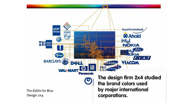
 2×4, a multidisciplinary design studio, conducted a visual research study showing the dominating color used by major international corporations. What this chart shows us is that there is room for growth in the industry, and a chance to stand out by using other colors associated with the same associations (i.e. “power”), such as yellow, bright pink, bright orange, purple, green etc.
One way to communicate to the consumers’ psyche is through color. The eye, just like the ear responds to waves of energy. Not all the light waves your eye takes in go directly to the visual center of the brain. About 20% of the light waves we take in go to the pituitary glad, the master glad of the endocrine system.
 The color red: causes more rapid breathing, increases blood pressure, heart rate and flow of adrenaline! Red is commonly associated with energy and excitement. It’s this association that contributes to a cohesive visual identity and successful packaging.
Be creative with your branding efforts. Remember, different is good. In his book, “Zag,” Marty Neumeier states that you need to be different to be heard. If that means going out on a limb with a crazy idea, then so be it. Sometimes the best ideas are the ones that scare the #$%% out of you.

