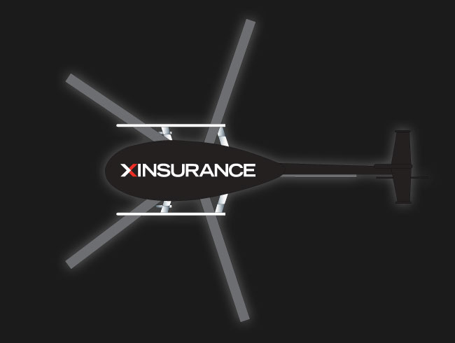
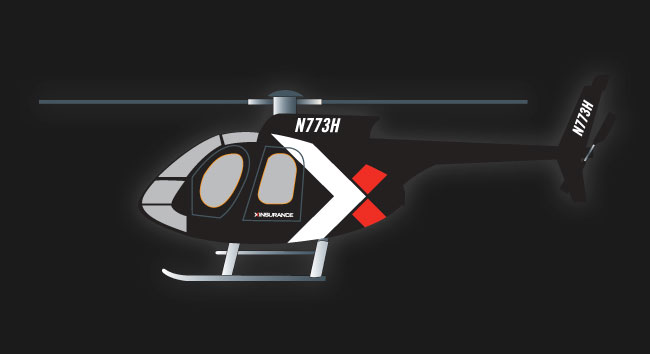
 Do you ever feel that your Helicopter just isn’t as cool as it could be? If you said yes, keep reading. We were just asked to design a new look for the XINSURANCE helicopter. If you’re planning on trying this at home, which I wouldn’t recommend, just keep these simple rules in mind.
What’s the mood you’re going for? Dark and sultry? Check.
We’ll make this one a shiny black.

Do you need your brand name on it? Check.
Add logo in a clearly visible spot (if you plan on flying, I suggest stamp it right there on the bottom). In the case of the XINSURANCE helicopter, we want to subtly add a design element, to emphasize the branded look and not distract from the sleek shiny black look. This is when I like to reference the Bob Ross‘ book of “Do’s.”

You’re a moving target. How are you going to make it easy for people to read?
Considering the fact you’re flying, we’re probably going to want to make sure the logo is large enough and readable. How do we do this you might ask? Add contrast! In this case, black is a great choice and adds the most amount of contrast possible when paired with a white logo.
Send your art to the body shop and voile! Your very own custom helicopter paint job!

