
We’ve all heard the idiom, “The devil is in the details,” which (not-so-subtly) refers to hidden or elusive elements, often with malicious potential. The phrase derives from the flip side of that coin that “God is in the details,” expressing the thought that everything should be done with a more comprehensive, overarching, and detail-driven approach. When it comes to design, both sides of this coin are always at play. We’re told to focus on the big picture, and that content is king, but it’s the little details that can either make or break a project.
Typography is riddled with details. Its so-called cup runneth over with potential punctuation pitfalls and errors ranging from mild to egregious to downright confusing. However, it’s not a practice that only designers and copywriters need to concern themselves with. Even if you only ever write words on Instagram or in texts to your mom, you should strive to use correct typography and punctuation because it looks nicer, reads easier, and makes you feel better about your life choices.
*Disclaimer: Before I profess what I deem to be correct, please know that I am no expert. I just know what I like and try to be consistent with it. For a real pro’s in-depth analysis of everything you’re typing wrong, read this article from Smashing Magazine.*
In the interest of time, I’m only going to focus on the number one typographic error I see—the misuse of hyphens and dashes. I know it’s confusing, so here’s a basic lesson:
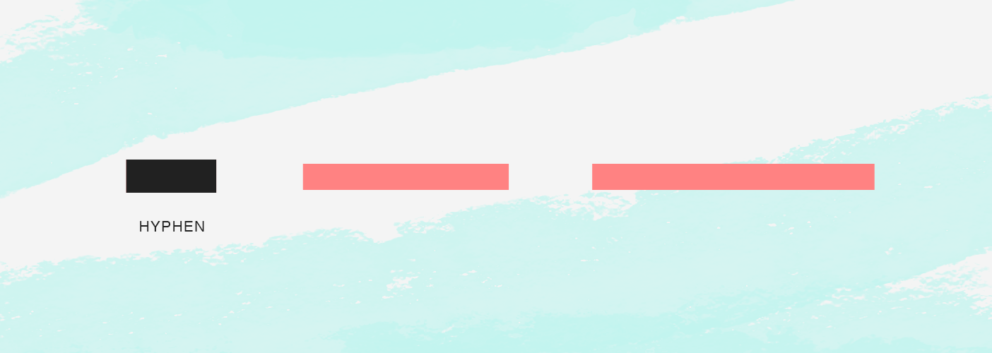
The hyphen (-) is the shortest. It is used for compound modifiers (“job-creating”) and to indicate that a single word breaks to the next line in a paragraph. The en dash (–) is most commonly used to connect a range of numbers or words (0–100). And the em dash (—) is used to represent a break in thought mid-sentence (I’m going to the grocery store—the one at the end of the block—for some bread.). Some sources indicate that a break in thought should be represented by an en dash with a space on either side. Personally, I prefer the look of an em dash with no spaces. Either way, choose your favorite and honor it.
If you’re using an Apple keyboard, type a regular hyphen simply by hitting the hyphen key located between the 0 and the +/= keys. The en dash is option+hyphen (alt+hyphen on a PC). And the em dash is shift+option+hyphen (shift+alt+hyphen on a PC). It’s a good thing Apple has all its design ducks in a row, because iPhone users also have access to all three marks. En and Em dashes can be accessed by holding down the hyphen key.

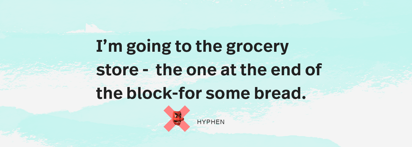
Whether you work in the advertising industry or not, typographic attention and proper punctuation marks are the kinds of details that go a long way in conveying professionalism and intended meaning. You wouldn’t leave a typo in your application letter; please don’t use a hyphen in place of an em dash. That lack of attention to detail is truly devilish.