
Typefaces are one of a designer’s most impactful tools. The wrong font can totally change the tone of a design or obscure the underlying message; the right font can transform a mediocre piece into a stellar one and clarify the meaning behind the content at the same time. Paying attention to the ebbs and flows of typography trends is crucial for creating work that not only appeals to the eye but also resonates with the right audience at the right time. By taking a broad overview of some of the recent developments in type design and their implementation in the real world, you too can keep up with the kerning in 2020.
The “Chobani” Serif
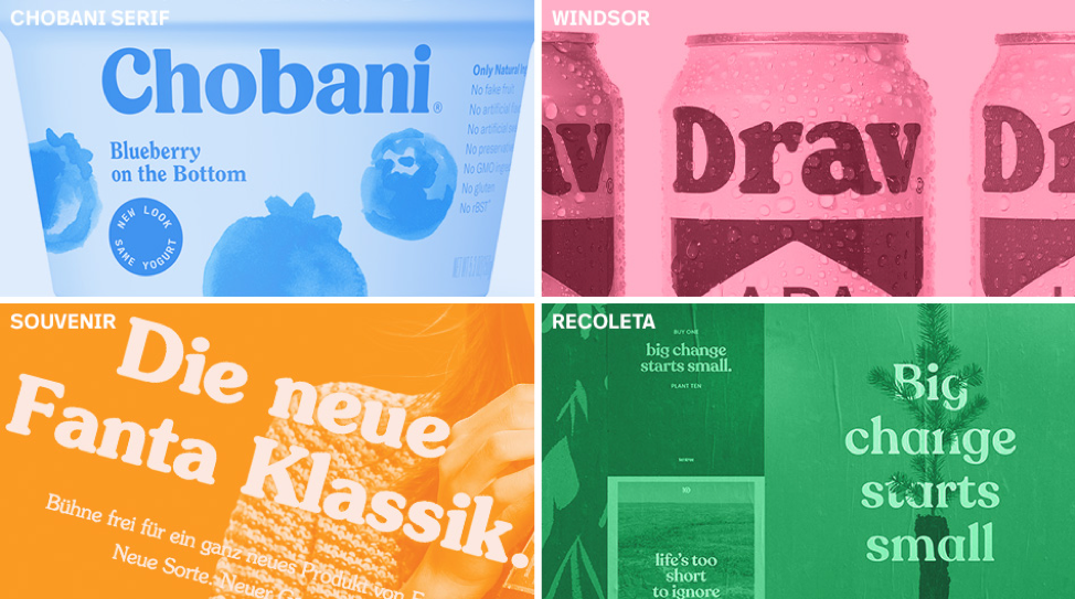
One of the most prevalent typography trends to gain speed over the past couple of years is the so-called “Chobani” serif. In late 2017 when Chobani unveiled its extensive rebrand, a major shift took place within the branding landscape. All of a sudden, brands were eager to project the same friendly, approachable tone that Chobani achieved with the introduction of their new logo and accompanying custom typeface, Chobani Serif (drawn by Berton Hasebe in collaboration with Christian Schwartz).
Characterized by plump curves, stubby serifs, and a tall x-height, the typeface effectively communicates a warm, nostalgic familiarity. And that’s by design. The organic letterforms harken back to time-honored typefaces like Cooper Black, Windsor, and Souvenir, which rose to peak popularity in the ’60s and ’70s. They were all originally drawn in the early decades of the 20th Century, and their appeal has now endured a hundred years’ worth of changing styles. The recent trend has spawned a good number of retro revivals and re-imaginings of the humble rounded serif, most popularly, Recoleta by Latinotype.
Deadpan Sans-Serifs
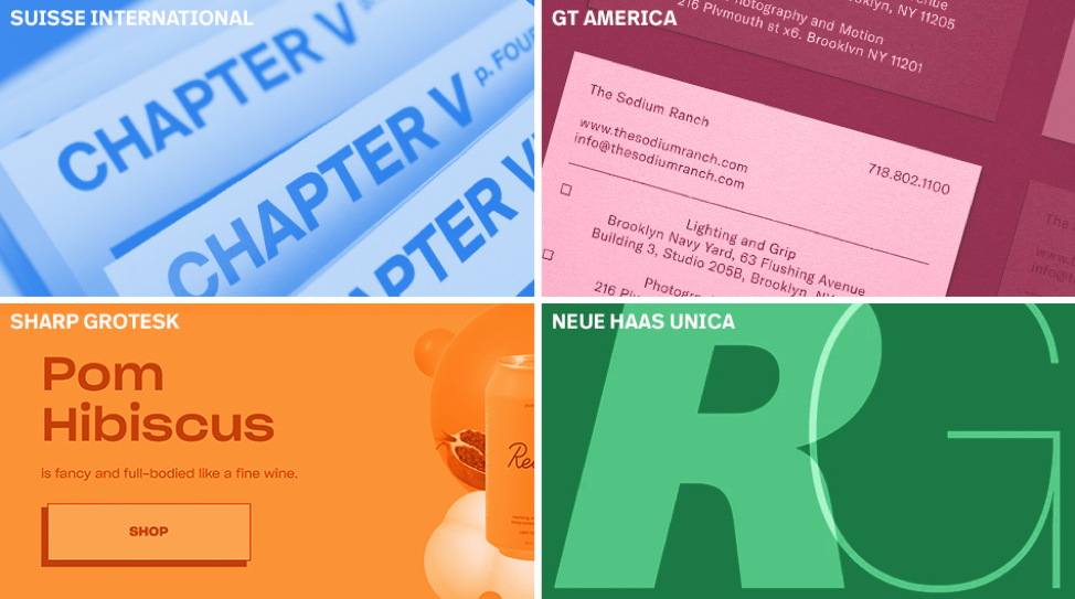
A popular typeface to pair with a friendly, rounded serif typeface is a no-frills sans-serif. These faces are often categorized as grotesque sans, in the same vein as Helvetica. But why settle for a system font when you can choose a typeface with a unique sense of refinement?
There’s been a recent surge in popularity for typefaces that feel like Helvetica, but add their own twist on the genre. Suisse International, GT America, and Sharp Grotesk are all good choices, ranging from most Helvetica-like to more unique. But if an idealist’s version of Helvetica is what you’re really after, go with Neue Haas Unica. It’s flawless.
Fun fact: the word “neue” (as in Helvetica Neue or Neue Haas Unica) is a German word, pronounced “noy-a.” Likewise, Neutraface should really be pronounced “Noy-traface” since it’s named after Austrian–American architect Richard Neutra.
Unconventional Everything
Contrast is the name of the game when it comes to pairing typefaces, and when you’re using tamer fonts like Recoleta or Suisse International, nothing makes a better sidekick than a hard-hitting, one-of-a-kind display face to really punch up a piece.
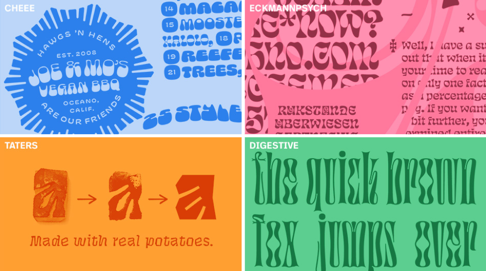
One source of truly innovative display typefaces to emerge in the past couple years is Future Fonts, a foundry of sorts billed as a place “where type designers sell fonts in progress.” It has become a breeding ground for mind-blowing ideas in type design. The site has nurtured the development of some legendary typefaces, including James Edmonson’s variable axis blob-fest Cheee and his equally imaginative reinvention of Eckmannschrift, Eckmannpsych.
Other notable releases include Tommi Sharp’s Taters (designed by carving actual potatoes), and the brain-bending Digestive from Jérémy Landes that would make a worm squirm with delight. Employing creative typefaces like these pushes the limits of legibility, while projecting a distinctive voice that isn’t easily ignored. And by purchasing and using these fonts during their development, you can help fund the growth of emerging type designers.
Keep your eyes open!
This is by no means a comprehensive list of the current typography trends; the design landscape is constantly shifting and it’s important to be on the lookout for new and exciting ideas. Whether you’re hoping to capture the current zeitgeist or buck the trends, knowing what’s going on in the world of type is crucial for creating effective, impactful work.
Here’s a few handy links to my very favorite resources for staying abreast of the latest developments: