Client
Downeast
Project Overview
Downeast is a successful clothing and furniture retailer with a long history in the state of Utah. Over the years they have cultivated a fun and whimsical brand that brings quality products to the fashion-conscious.
Services
- Branding
- Packaging
Problem
In the midst of growth outside of its traditional Utah markets, Downeast lacked a robust visual identity that would appeal both to its existing customer base and a new, broader audience.
Solution
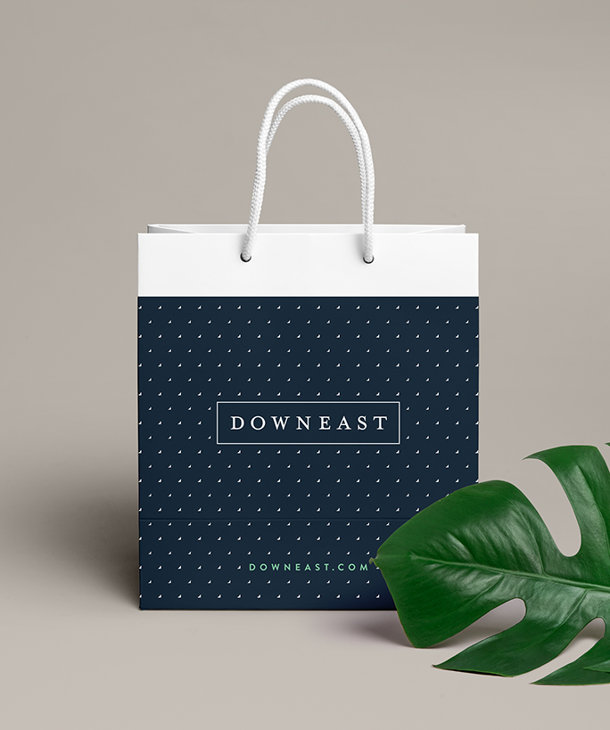
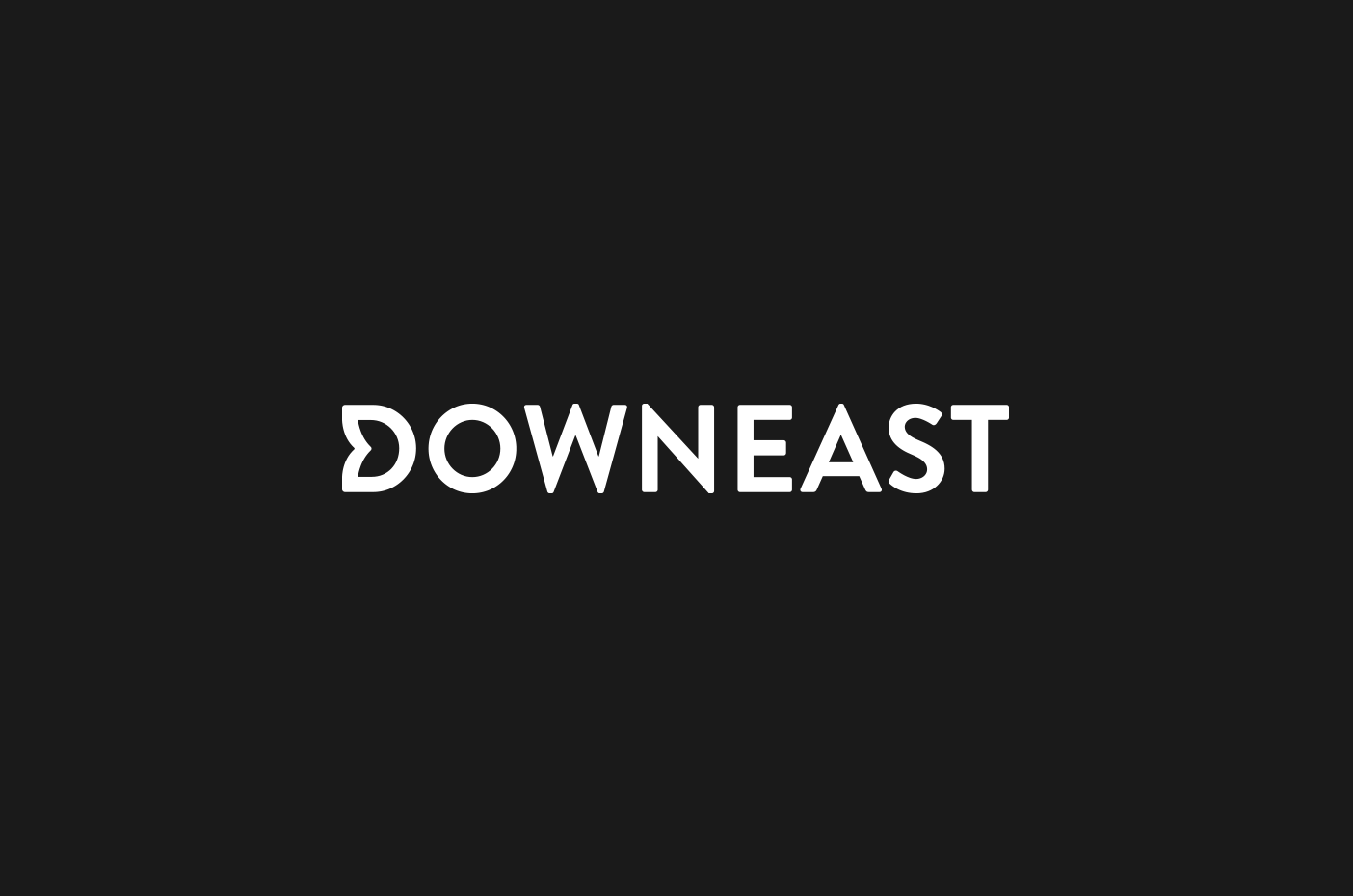
Brand research and high-level discussions with company leaders revealed equity and recognizability in several of Downeast’s past logos. The final logotype is a fairly conservative evolution of a previous iteration, using uppercase letters with generous letter spacing to feel more simple and sophisticated. The rest of the visual identity infuses striking and playful energy into the color palette, pattern set, and typography.
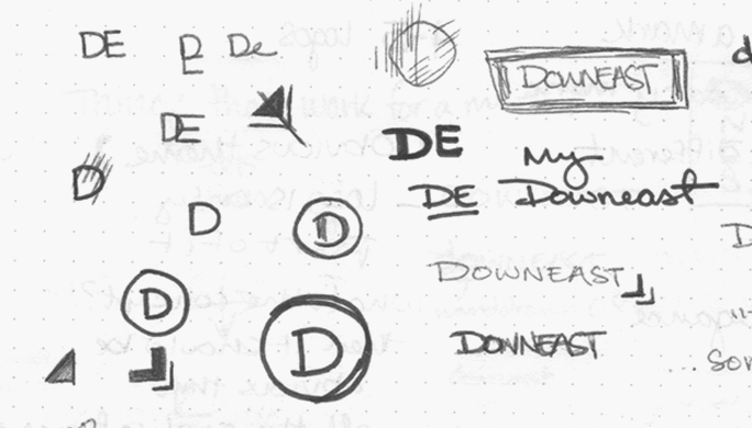
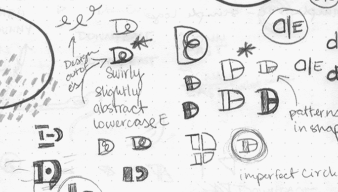
The clothing and furniture industry allowed us ample opportunity to be creative with the identity. During the ideation phase, we explored a wide range of styles and directions for the potential Downeast logo: everything from geometric patterns to organic textures. In the past, Downeast had no abbreviated mark to use with their logotype and, considering much of their audience skewed towards younger females, we knew we had to keep in mind a scalable identity that could work just as well on a billboard as across social platforms.
Many of our early logos walked a fine line between masculine and feminine, playful and sophisticated, classic and modern. Ultimately, the final logo is a more neutral design that pays homage to Downeast's past but still helps to elevate the brand to its audience.

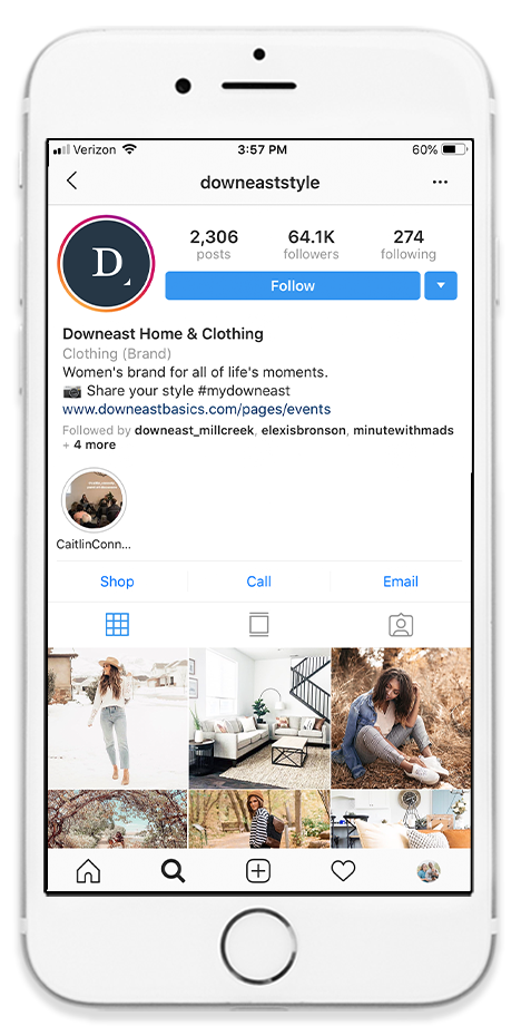
Through research, we found that many people associated a boxed logo with Downeast. Because of that, the new logo comes in three three variations: an outlined box, a solid box, and a box-less logotype. An abbreviated monogram avatar was also designed for social media avatars with a small arrow pointing down and east.
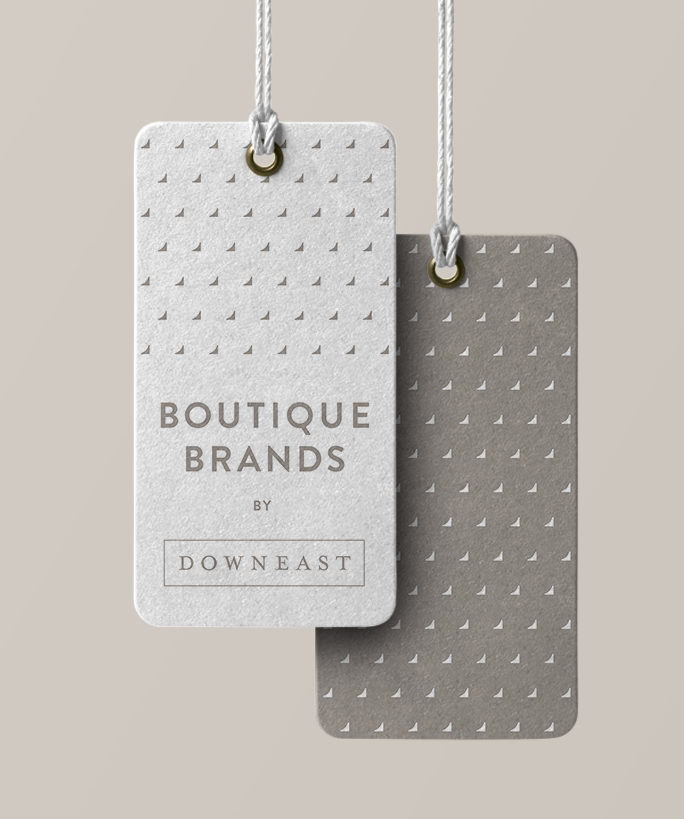

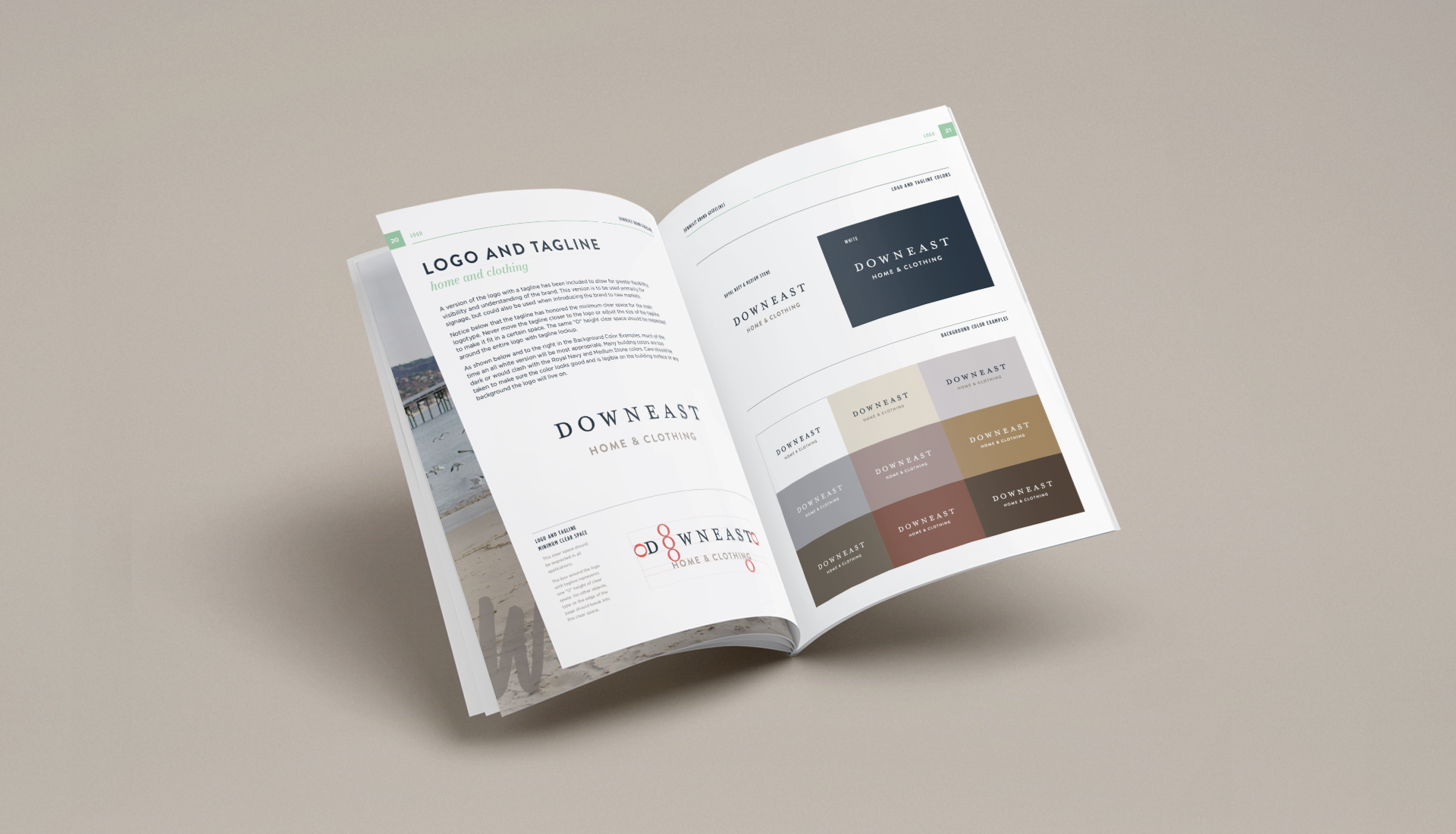
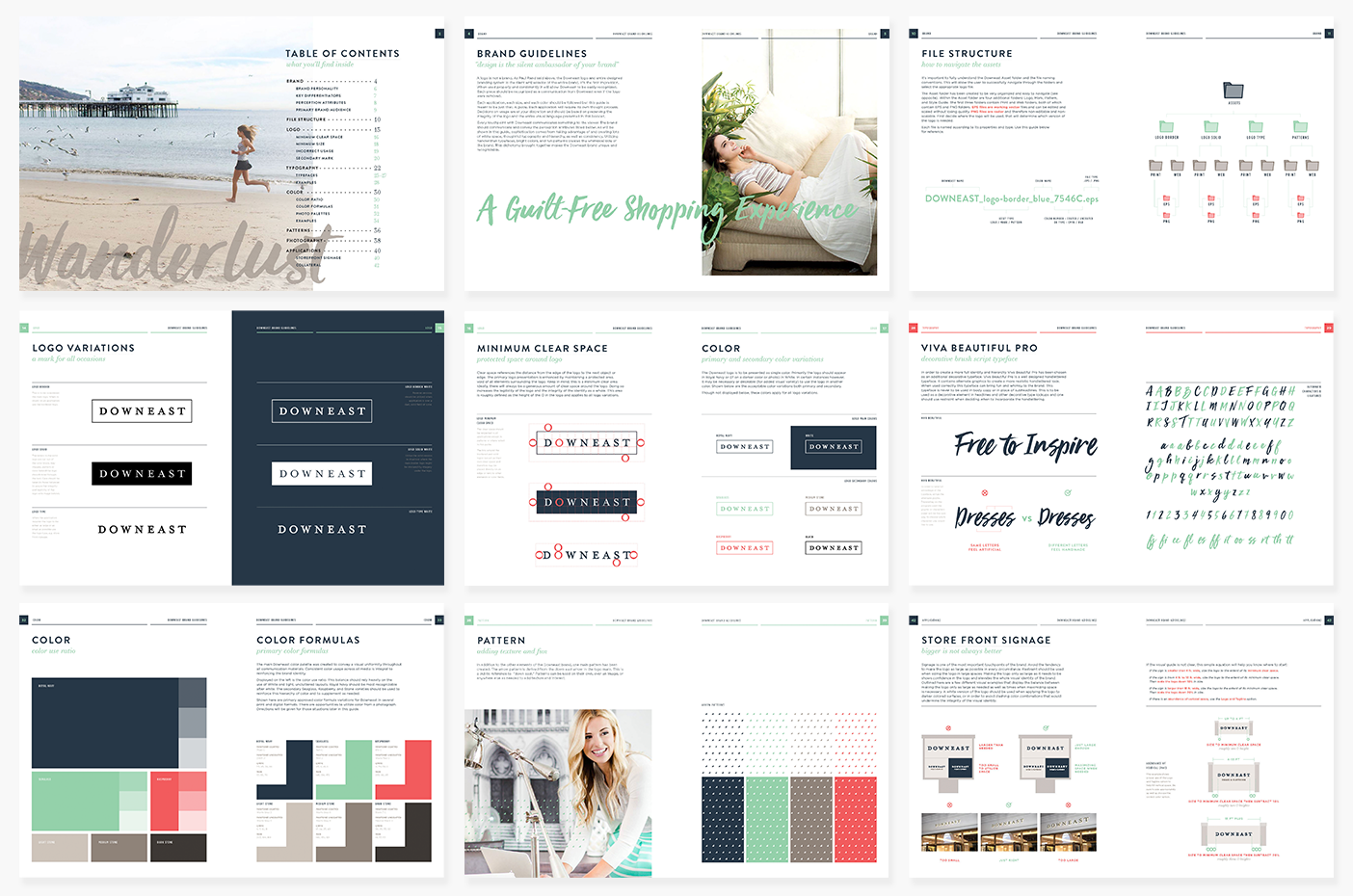
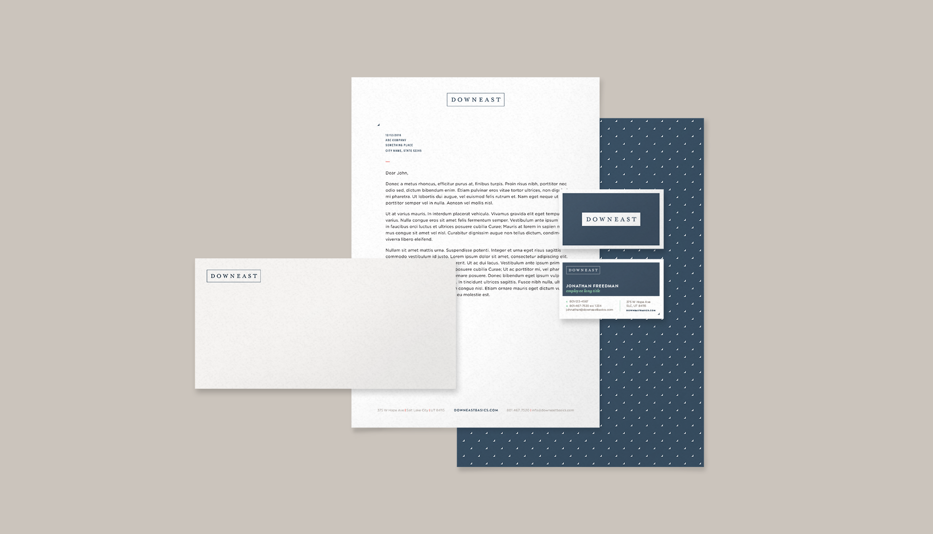
We created an extensive brand book that details all aspects of the brand and the new visual identity. One particular request was to include detailed instructions regarding the sizing of the new logo on signage and storefronts. Once the identity was established, we applied the new look to stationery, in-store bags and tags, and advertisements.