Client
Lehi City
Project Overview
When the small town of Lehi, Utah suddenly became one of the state's fastest growing cities, a rare blend of small town sensibility and metropolitan energy created a distinct, but strong personality.
Services
- Branding
- Web
Problem
The sixth oldest city in Utah lacked a cohesive and aesthetically impactful visual identity to match its newfound personality. In the midst of irreversible growth and progress, Lehi City needed a brand to match—while also maintaining its deep-set roots of traditional values and community involvement.
Solution
Through extensive market research and resident surveys, we began to define a picture of Lehi City and its people. By depicting traditional landmarks in a modern aesthetic, the new logo brings together all the best elements of old and new.
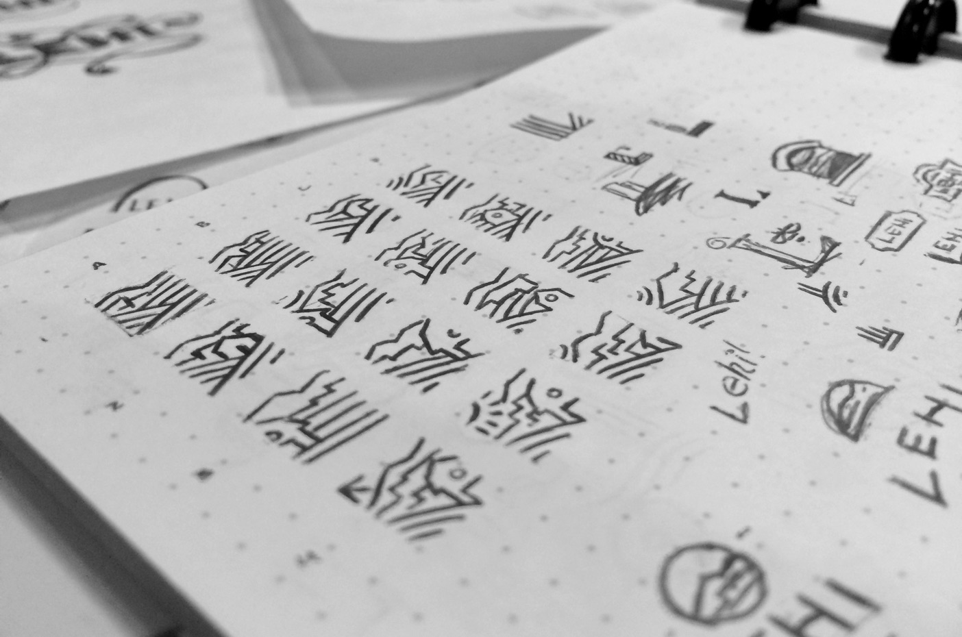
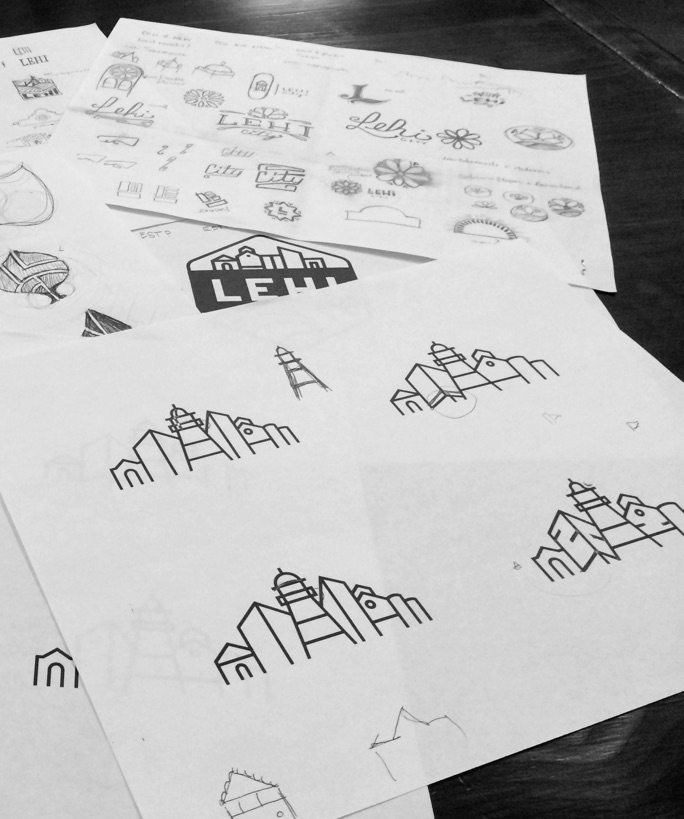
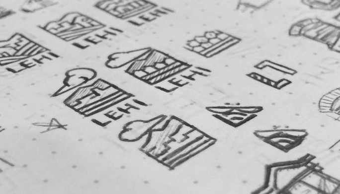
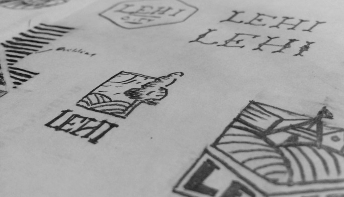
With such a well-defined dichotomy of the traditional past and the tech-savy future, there was a plethora of potential symbols to draw from. Our early logo explorations referenced icons unique to either Lehi City or Utah in general: rolling farm fields, historical buildings, honey bees, cottonwood trees, and the burgeoning tech industry.


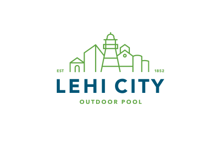
The final logo design leans on Lehi’s iconic architecture—from the historic Memorial Building to the new Adobe campus—in order to encapsulate the city’s unique bend of small town sensibility and metropolitan nature. The flexible logo system was designed to feel strong and rooted, yet cheerful and wholesome.


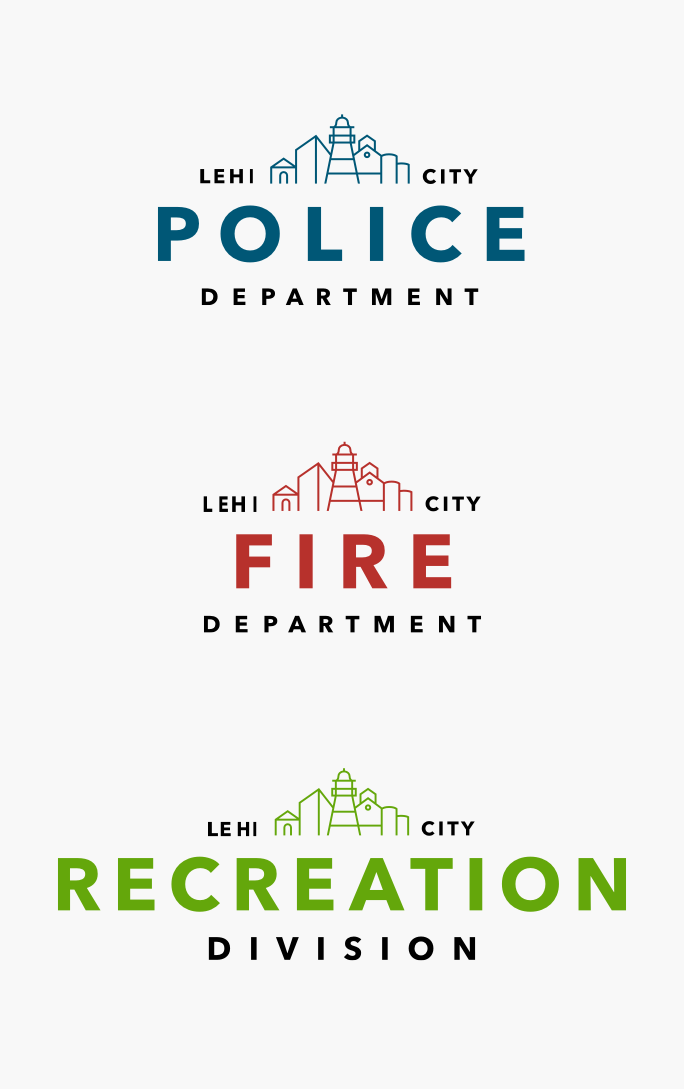
The flexible nature of the logo allowed a smooth adoption by the three main departments of the city: Police, Fire, and Recreation. Additionally, a tertiary level of logos was designed to fit the needs of dozens of departments within the city.


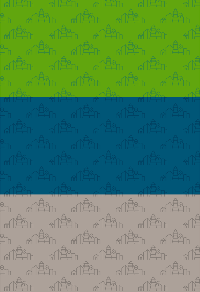
We developed a brand pattern in green, blue, and gray and applied it to several of the rebranded applications.
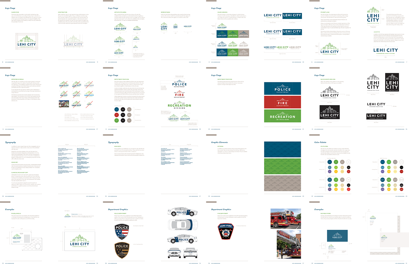
An extensive style guide was developed in order to provide a secure foundation for understanding the new brand and its visual identity. Among the included sections were brand personality and audience, perception attributes, logo construction and usage, rules regarding typography and color, and various examples of applications.
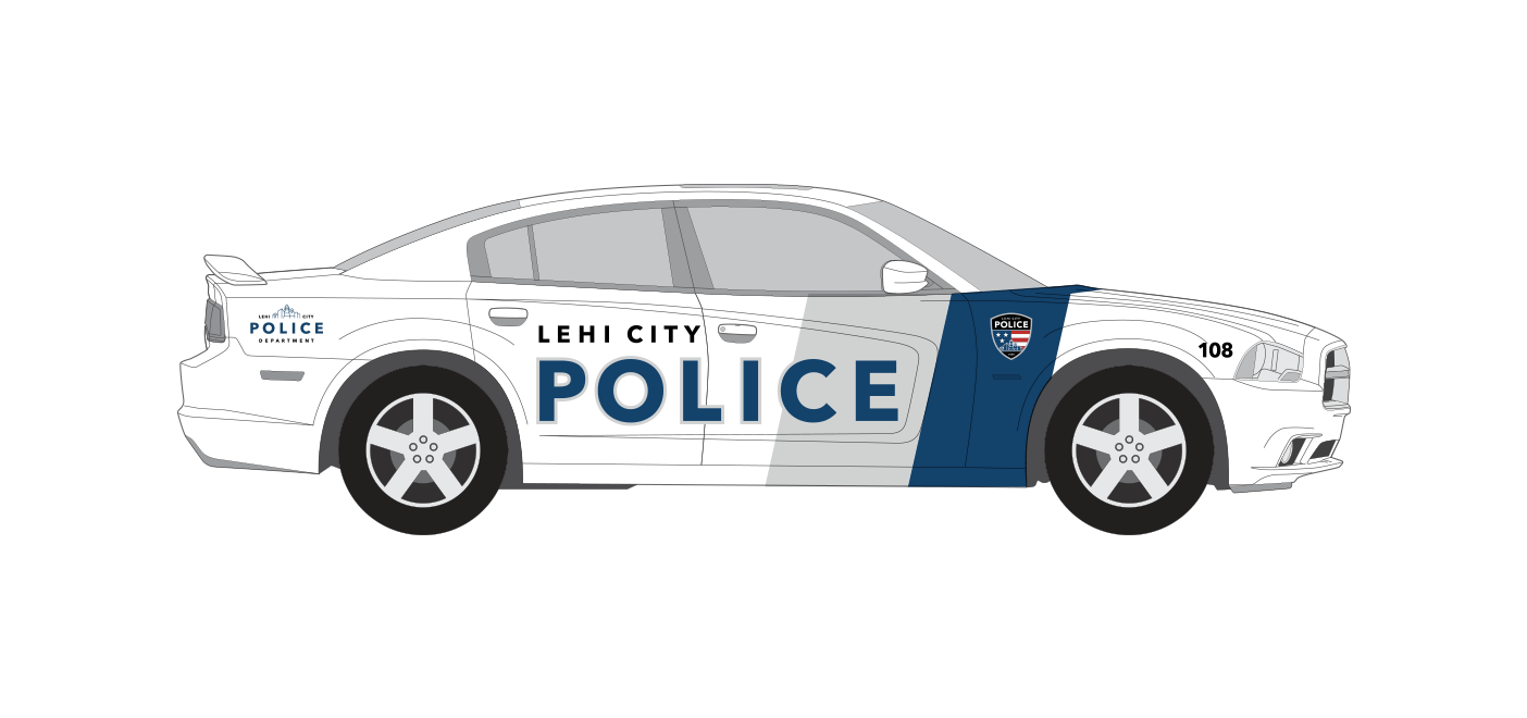
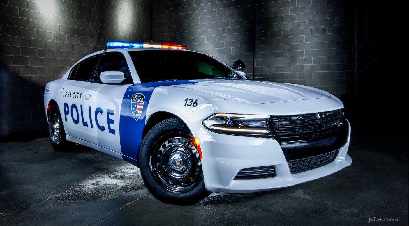
In a unique design project all its own, we worked with the Police and Fire Departments to design patches for both departments as well as a police car wrap, which has since been adapted to other vehicles in the fleet.
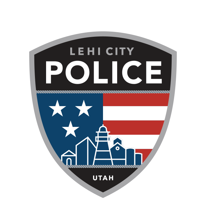
The regular police force and the SWAT team both utilized the same basic patch design. However, where the police wanted to be bold and bright, the SWAT team required a more conspicuous palette.
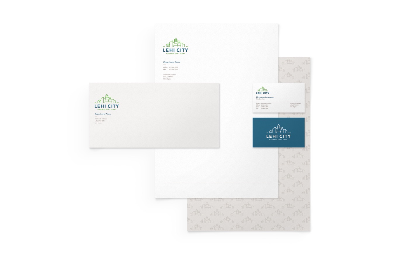
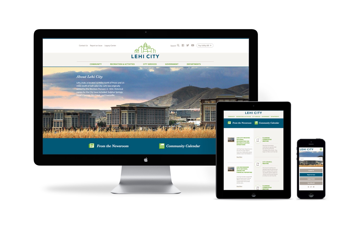
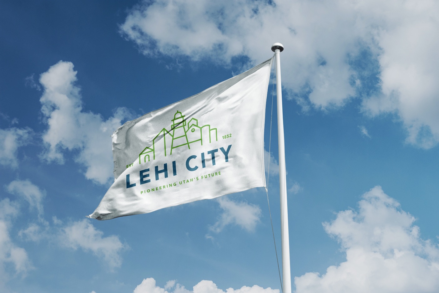
The new visual identity for Lehi City has been applied across a wide variety of materials including stationery, vehicle and trailer wraps, a responsive website and a city flag.